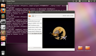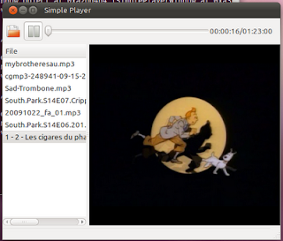
Saturday, June 18, 2011

Coding an Undo/Redo Stack


The other night I put (what I think are) the finishing touches of an Undo/Redo stack for Photobomb. This is the second time I've written an Undo/Redo stack, the first time being for the TextEditor Quidget. Neither time was I able to find much guidance for how to approach the problem. I handled it slightly differently each time. I thought I'd write up a blog post about how I approached Undo/Redo for Photobomb, in case it helps someone else out.

Generally, the way I conceived the problem was to keep a list of actions that needed to be undone. When an action is undone, then that action needs to be added to a list of actions that can be redone. But what does it mean to store an action in code? I thought of 2 approaches:
  1. Keep a list of actions as functions along arguments to pass to those functions.
  2. Keep a list of "backups" for every change made to an object, and on redo swap out the backup for the actual object.
List of Actions Approach
I took the first approach back when I wrote TextEditor. It was easy to do because the only actions supported by Undo and Redo was that something could be added to the TextBuffer, or something could have been removed. So I very literally stored a list of functions and elements. So on a change, such as when text has been inserted, I store point at which the text was inserted, along with the inserted text:
     cmd = {"action":"delete","offset":iter.get_offset(),"text":text}
self._add_undo(cmd)

The _add_undo function merely ensures that the list does not grow beyond a defined maximum, and adds it to the undo list:
   def _add_undo(self, cmd):
if self.undo_max is not None and len(self.undos) >= self.undo_max:
del(self.undos[0])
self.undos.append(cmd)
The heart of the __add_undo command was to extract the command to undo, and pass it along to _do_action(), and then add the return value of undo to redo stack.
     undo = self.undos[-1]
redo = self._do_action(undo)
self.redos.append(redo)
del(self.undos[-1])
do_action, in turn read the type of action, did the specified action, and returned the opposite action so it could be used for redo.
     if action["action"] == "delete":
self.get_buffer().delete(start_iter, end_iter)
action["action"] = "insert"
elif action["action"] == "insert":
self.get_buffer().insert(start_iter, action["text"])
action["action"] = "delete"
return action
So by keeping a mapping of actions and their opposites, and by using a dictionary to store the information needed to undo or redo the action, this system worked well for simple case of simple text editor.

List of Backup Approach
Not surprisingly, when I approach this problem in Photobomb, I followed the same basic solution path. For example, I set up a list to store undo actions in. I then started storing a code for actions like I used for delete and insert in the text editor. However, I quickly ran into some problems. Photobomb is more complex then TextEditor, and GooCanvas is more complex than TextView/TextBuffer. For example, storing all the info needed for undoing and redoing a clipping path on an object required some more complex code than seemed right for the problem. So, I switched to the second approach.

Here, I store a list of undos, but what I store in the list is objects. A "new" object, as in the object after the change, and the "old" object. Kind of like the backup.

To store an undo in this system, I make a back up of the object, change it, and then add the undo:
       saved_item = self.back_up_item()
self.selected_item.move(delta_x,delta_y)
self.add_undo(self.selected_item, saved_item)
Making the backup entailed duplicating the entailed not just making a copy, but removing the copy from the goocanvas, and storing the z-order. GooCanvas doesn't track z-order for you, so I had to track it myself. Every object on the GooCanvas suface derives from a subclass of the custom PhotobombItem and one of the built in GooCanvas types, such as goocanvas.Image). PhotobombItems have a duplicate function witch return a copy, and a remove function. So getting a copy was easy.
   def back_up_item(self, item=None):
if item is None:
item = self.selected_item
copy = item.duplicate(True, False)
copy.remove()
index = self.z_order.index(item)
self.z_order.insert(index+1,copy)
return copy
I quickly found that it is insufficient to simply store a pair of old and new objects for each undo. This is because an object can be modified twice in a row. And if you store the object itself, rather than a copy of the object, the undo stack will reference the object in whatever is it's current state, so undo can appear to weirdly go backward.

For example if I make an item, call it O1 bigger, I'll store a copy of O1, call the copy O1.1, and O1 as the old and new items, respectively. Then if I make it bigger again, I store another copy of O1, call it O1.2, and O1 *again*. So undoing will go O1 is replaced by O1.2, which looks right, but then undo again and O1 will be replaced by O1.1. But oops, O1 was already replaced, so O1.1 appears, but O1.2 was never replaced.

To guard against this, I looked backward through the undo stack to see where in the current undo stack the object appears last, and I take the current backup of the "old_item" and make that the "new_item" for the previous undo. So, for then making something bigger would store O1.1 and O1 again, but then making it bigger again, it would replace O1 with O1.2 as the "new_item" and then store O1.2 and O1 as the new_item at the top of the undo stack. So undo would replace O1 with O1.2, and then O1.2 with O1.1, and everything seems to work.

That was a pretty long winded explanation for not that much code. Basically, I loop back through the undo stack and update the last occurrence of the object being added with the copy before going ahead and adding the objects to the stack.
   def add_undo(self, new_item, old_item):
#ensure proper undos for multiple edits of the same object
if len(self.undos) > 0:
for item in self.undos[::-1]:
if item["new_item"] is new_item:
item["new_item"] = old_item
break
self.undos.append({"new_item":new_item,
"old_item":old_item})
self.redos = []
Note that I also reset the redo stack whenever the undo stack is modified.

So what does undo and redo do? They function in a very similar manner to the undo/redo functions in the text editor. First, they get they item from the top of the stack and stick it on the other stack. So for undo:
     undo = self.undos[-1]
self.redos.append(undo)
del(self.undos[-1])
Then they remove the new item, and restore the backup (assuming they both exist). If there is no backup, that means the item was just created, so removing the item is sufficient. Conversely, if there is no new item, then it means the item was deleted, so adding it back to the canvas is sufficient. Finally, the function has to position the new item in the z-order and then select the new item.
     if undo["new_item"] is not None:
undo["new_item"].remove()
if undo["old_item"] is not None:
undo["old_item"].set_property("parent",self.__root)
next_item = self._find_item_above(undo["old_item"])
if next_item is not None:
#position in z-order
undo["old_item"].lower(next_item)
self.selected_item = undo["old_item"]
self.__reset_selection()
Redo does essentially the same thing, only removes old_items and restores new_items. There was about 100% code duplication between the undo and redo functions. However, I decided to keep the duplicate code in place because I was worried that if I have to go back and fix bugs in a year or so, I'd need the code to be crystal clear about what it did. I can always refactor into a common function later, but for now, I felt that the duplicated code was just easier to read and understand.

Now, calling these functions is easy in cases where a menu item was used to change on object, as there was one and only one change to store in the undo stack. But sometimes it's not so easy. For example, Photobomb has what I call "Press and Hold Buttons". To make an item bigger, for example, you can use the Bigger menu item, or you can hold down the Bigger button until the selected object is the size that you want and release the button. The button emits a signal called "tick" every 100 milliseconds, which is bound to an action, in the case, the "self.bigger" function. This causes the item to get bigger many many times (about 10 times per second, in fact) but the user is going to think of it as one action to be undone.

In order to handle this case, I created two signal handlers, one for the press event and one for the released signal of a button. All the Press and Hold buttons use these handlers. The press signal handler creates an immediate copy of the item, and then connects the tick and the released signals. Occasionally, the released handler gets called twice, which causes some confusion, so I track the tick signal to make sure that the released signal is only handled once.
   def pah_button_pressed(self, button, action):
old_item = self.back_up_item()
tick_signal_id = button.connect("tick",action)
button.connect("released",self.pah_button_released, (tick_signal_id, old_item))
Then in the released signal, I add the new item and the old_item to the undo stack, assuming it hasn't been already.
   def pah_button_released(self, button, args):
tick_signal_id, old_item = args
#work around released signals being called multiple times
if tick_signal_id in self.__disconnected_tick_signals:
return
self.__disconnected_tick_signals.append(tick_signal_id)
button.disconnect(tick_signal_id)
if self.selected_item is not None:
self.add_undo(self.selected_item, old_item)
Now only 1 undo is added when a Press and Hold Button is used.

Another challenge to overcome in this system was handling the user changing selection by clicking on an item versus when the user clicked and dragged an item. The latter should be added to the undo stack, but not the former.

Fortunately, this can be handled with a similar pattern. The mouse_down signal handler creates a copy of the item, and passes it to the mouse_up signal handler.
           old_item = self.back_up_item(clicked_item)
self.__mouse_up_handler = self.__goo_canvas.connect("button_release_event",self.drag_stop, old_item)
Then the drag_stop function checks if the item was actually moved before adding to the undo stack. If the item hasn't been moved, then the selection has simply changed.

Finishing Touch
One last finishing touch is to ensure that the undo and redo menu items are only sensitive if there is anything in the undo and/or redo stacks. Photobomb handles this by connecting to the activate signal of the edit menu, and then checking if there is anything in the undo and redo lists, and setting the sensitivity accordingly.
   def edit_menu_reveal(self, widget, data=None):
active_undos = len(self.undos) > 0
active_redos = len(self.redos) > 0
self.builder.get_object("menuitem_undo").set_sensitive(active_undos)
self.builder.get_object("menuitem_redo").set_sensitive(active_redos)

There is a lot of ineractivity in photobomb, and this creates a bit of complexity in handling undo/redo. You can see all the code in context in the photobomb trunk.

Tuesday, April 19, 2011

My Effort at Writing Help for Unity


I told the kind folks in #ubuntu-doc that I'd give it go, writing up some documentation for Unity. Here's a first draft of my best effort. I'm hopeful that the real pros at this can mine this material for making nice official documentation. I'm hoping that thay can cut and paste from here into their docs, or at least can edit the content to something they like, but maybe get going a little faster since there is something to change, rather than having to start fresh.

I don't believe myself to be a particularly good writer, but, here without further a do ...

Overview

The Unity environment has four areas that, combined, allow full operation of Ubuntu.
These areas are:
  1. The Application Area. This is the main area of the screen for applications and documents.
  2. Indicators. Indicators run along the panel at the top of the screen, off to the right Indicators are persistent widgets that are always available for reference and Controlling Ubuntu. Indicators include functionality for things like networking, power, messaging, time, and managing a session.
  3. The Launcher. This provides access to favorite applications and running applications.
  4. The Dash (not shown). The Dash provides very fast access to applications and files via searching or browsing. The Dash can also be customized with new "lenses" to allow other types of searching.

How to Activate Applications via the Launcher


If the icon for the desired application is on the launcher, you can simply click on the icon, and it will launch the application. If the application is already running, clicking on the icon will activate the running application and bring it to the front. For example, if you click the Firefox icon on the launcher, this will launch Firefox, unless a Firefox window is already open, in which case Firefox will be brought to the front.

After launching an application, The Launcher, my "autohide" by sliding off the screen to the left. If this happens, it can be easily accessed by pointing the mouse all the way to the of the screen and waiting for the launcher to appear, or pointing to the top left corner of a screen will cause the launcher to appear instantly.

Running applications will have one tickmark to the left of the icon for each Window that is open. In this way, it is possible to see how many windows are open for an application.

Clicking on an icon with the middle mouse button will open a new window for a running application. Some applications also support open a new window via a "Quick List". Right clicking on an icon will reveal the Quick List for the application. For example, Firefox has a "Open New Window" option in the Firefox Quick List.

The Launcher can also be used via the keyboard, without the mouse. In order to activate an icon on The Launcher, press and hold the meta key on the keyboard (for example, on computers that came with Windows installed, there may be a Windows logo to mark the meta key). Pressing and holding the meta key will cause The Launcher to open, and each icon on The Launcher will be marked with a number or letter.

Clicking the keyboard key with the number or letter that corresponds to the desired icon while still holding down the meta key will activate that icon. Holding down the shift key as well while doing so will launch another instance of the application, similar in function to middle clicking with the mouse.

How to Activate Applications from the Dash


The Dash is activated by clicking on the Ubuntu logo in the top left of the screen, or by tapping on the meta key. When The Dash is activated in this way, it defaults to the Global Search lens. Commonly used applications and application categories are available by default.
The Global Search lens searches files as well as applications, so files can be quickly accessed in the same manner.

To quickly activate an application, typing the first few letters of an application will show the application's icon, which can then be clicked to activate. Alternatively, typing the Enter key on the keyboard will cause the first item in the list to be activated. In this way, an application can be run very quickly by tapping the meta key, typing the first few letters of the applications name, and pressing Enter.
The More Apps icon allows browsing of all installed applications. This view can also be activated by the Applications Lens icon on The Launcher. Applications are grouped into three categories, most frequently used, all installed applications, and applications that are available to be installed via Software Center. Note that if

Any of these section can be expanded by clicking the "See more results" link. For example, clicking "See more results" on installed applications will show all installed applications.
To limit the displayed applications to a category of applications, a category can be selected via the category selection dropdown.
The Quick List for the Application Lens allowss fast access to an application category.
Choosing one, will open The Dash and disply the selected category.


Adding an Application to The Launcher


An application can be added to the launcher by dragging the application's icon from The Dash onto the launcher. Alternatively, when an application is running, the Keep in Launcher item in the application's Quick List will permamently add the application to The Launcher.

Once on The Laucher, an icon's position on The Launcher can be changed by dragging it first off of The Launcher, and then back onto it in the desired location.

Finding and Opening Files


Files can be quickly searched and opened from The Dash. The Dash is activated by clicking on the Ubuntu logo in the top left of the screen, or by tapping on the meta key. When The Dash is activated in this way, it defaults to the Global Search lens. Commonly used applications and application categories are available by default.

The Global Search lens searches applications as well as files, so applications can be quickly accessed in the same manner.

To quickly open a file, typing the first few letters of the file name will show the file's icon, which can then be clicked to open. Alternatively, the icons can be navigated with the arrow keys, and typing the Enter key on the keyboard to open the selected file.


The Files and Folders Lens supports browing for files. The Files and Folders Lens can be activated via the Find Files icon in the Global Lens, or by clicking on the Files and Folders Lens icon on The Launcher. This lens presents recently used files, and commonly used folders.


Any of these views can be expaned using the "See more results link".

Searching file title and contents is supported in the search field, producing a list of results if any matching files are found.


The Files and Folders Lens also supports browsing for files by type, by choosing a type of file from the file type dropdown.


Selecting a file type will produce a list of files ordered by time.


While a file type is selected, search results will be limited to that file type.

The Quick List for the Files and Folders Lens icon on The Launcher allows fast navigation to a file type filter in The Dash.


Running Applications in Unity


With a few exceptions (notably Libre Office) menus for an active application window will be availble on the long top panel of Unity, in the Menu Indicator. When the menus are not active, the window title will be display there.


To see the menus that are available, simply hover your mouse over or near the window title, and the menus will be revealed, and you can then click on them.


Alteranatively, pressing the Alt key will also review the menu for the active window, along with any available keyboard accelerators.


Running applications will have one tickmark to the left of the icon for each Window that is open. In this way, it is possible to see how many windows are open for an application. Clicking on the application's icon in The Launcher will bring the application to the foreground.


Clicking on an icon with the middle mouse button will open a new window for a running application. Some applications also support open a new window via a "Quick List". Right clicking on an icon will reveal the Quick List for the application. For example, Firefox has a "Open New Window" option in it's Quick List.


Managing Windows


Switching Between Active Windows


Ubuntu offers many methods for managing and switching between mulitple windows. The fastest way to switch between a window on top, and a window directly below it to hold down the Alt key, and quickly pres the Tab key. This will cause the top window to switch places with the second window. Quickly tapping Alt and Tab again will switch them back. Two windows can be alternated very quickly in this manner.

Alt and Tab can also be used to switch to a window that is not the second window. Pressing the Alt key and holding down the Tab key will quickly bring up a list of open windows. Pressing Tab will select each window in turn. Release Alt and Tab will cause the currently selected window to come to the front.


If there are mulitple windows open for a particular application, clicking on The Launcher icon for the desired application will reveal of all the windows. Clicking on the desired window will bring that window to the front.


Pressing the Meta key and W will cause all open windows to be revealed, no matter the application with which they are associated. This faciliates quickly finding any application that is open, no matter the Workspace the window is on.

Window Size and Positioning


Document and application windows typically have the following three buttons for controling the size and visibility of the window:
  1. close
  2. minimize
  3. maximize


Clicking the close button will close the current window and potentially quit the application as well.

Minimize will hide the window altogether. A minimized window can be accessed by clicking on the application's icon in The Launcher, or by navigating to the window by holding down the Alt key and holding down the Tab key and then tapping the Tab key until the minimized window is selected.

A window that takes up the whole screen is "maximized". For an unmaximized application, clicking on the maximize button will cause the window to maximize. Clicking on the maximize button for a maximized will cause the window to unmaximize.

A window can also be toggled between maximized and unmaximized by double clicking on the applications titlebar.

Dragging an unmaximized window's title bar to the top of the screen will maximize the windw. Dragging a maximized windows title bar to the center of the screen will unmaximize it. Dragging a window by the titlebar to the the right or the left of the screen untl the mouse pointer touches the edge, will resize the window to take up half of the screen. This can be useful for sizing windows and using them side by side.

Workspaces

Workspaces provide a means for organizing windows into groups, and quickly switching between those groups. For example, windows associated with work could be grouped onto workspace 1 while windows associated with chatting with friends could be groupled onto workspace 2. By default, all applications are opened onto Workspace 1. There are four available workspaces.
Clickng The Workspace Switcher on The Launcher provides an overview of the four workspaces, arranged in a grid.
Clicking on a workspace, and then clicking on The Workspace Switcher will make that workspace the active workspace. Applications launched from The Launcher or The Dash will be open on the active workspace.
Note that clicking on an icon in The Launcher for an active application, will navigate to that application. If the application is on a different workspace, that workspace will become active. A new window for an application can be open by middle clicking on the application's icon in The Launcher, or using the Quick List for some applications.
Holding down the Meta key and Clicking S is a short cut for activating The Workspace Swithcer. Holding down the Control and Alt keys, and clicking on the arrow keys very quickly navigates between workspaces.
Window can be moved between workspaces while the Workspace Switcher is active by simply dragging windows between the workspaces.

Settings


System Settings can be accessed via the Control Center dialog. To activate the Control Center, select System Settings from the Power Menu.
You can then choose the specific settings you are interested from the list.
Alternatively, you can navigate directly to the settings that you are interested from The Dash.

Thursday, April 7, 2011

Congrats to GNOME!


Today you'll see the above banner on http://www.ubuntu.com/, as the 2nd banner linking through to the Gnome web site. That's because yesterday was a big day for the GNOME team, they delivered GNOME 3.0. Yesterday the GNOME community got the ball over the goal line, and delivered GNOME 3.0! An exciting time, indeed.

I know from my own experiences how difficult it is to do what they did. Delivering GNOME 3.0 with all it's platform improvements and it's slick new experience is a momumental achievement of teamwork and leadership. GNOME 3.0 is a major contribution to Free Software, and it continues the GNOME tradition of user-centered design, and community-centered development. GNOME 3.0 will be instrumental in powering Ubuntu for years to come, as well as countless other distros and projects.

The release itself seems flawless, from the product they delivered to the roll out on the website.

Congrats and also a heartfelt "Thanks" to all my friends in GNOME.

Tuesday, April 5, 2011

Unity Almost There


So, I'm a bit surprised how much people liked my spider diagrams to update folks on my perception of the state of Unity. It's been hard to update that last few months, just because Unity has been changing so fast. However, those changes have slowed down, and I've gotten some requests, so here is my post-beta 1 spider diagram for Unity.

As you can see, the orange line, Unity, almost overlaps the yellow line, our target for Natty. Obviously, this is a major accomplish for many teams involved in this project. I've been using Unity and my netbook and on my desktop for months now. Over the last few weeks it has crisped up into a very tight experience. Of all the desktop environments I have ever used, Unity is by far my favorite.

Here are some notes on the remaining gaps:

Crashers
One thing not reflected in the graph is the number of crashers, particularly in compiz, that have been reported. The crash reports have slowed down, and the crashes are getting fixed. If we stay focused, I believe that we will fix all of the common, and most of the not so common crashers.

Accessability
The only very painful gap is in accessability. Unity is very keyboard friendly, so that's good. The Launcher is completely exposed to screenreaders, so that's good. However, the dash is not completely exposed to screen readers. This means that blind users won't be able to use Unity without some modifications. This is unfortunate, indeed. Fortunately, the "classic" desktop is still as accessible as it has always been. Work continues on making the dash accessible, but it won't make it into Natty by release. I'd love to see a PPA or even an SRU to close this gap after release.

Search
Search is good, however, there are certain substring searches which maddenly don't work yet. For example, if I search for "Torrent" I don't get Transmission in the list, because it's a "BitTorrent" client.

Find and Launch Apps
I think the category view is good, but could be a bit easier to find and activate.

Dash Performance
Sometimes when I do a search in the Dash, it thinks for a bit before it responds to my enter key. This slows me down a bit when I am trying to launch something quickly.

Monday, April 4, 2011

Video Demonstraton of a Few Things I Like in Unity

Here are a couple of quick videos I made this morning demonstrating some things that I think are cool in Unity.

EDIT: Please note that Unity actually goes much faster than it appears to in these videos. There are certain points where the video didn't really seem to keep up with Unity for some reason.

Dash
This demo shows using categories in the dash, and also being able to use the dash to quickly open apps without using the mouse.


Launcher
This demo shows using the meta-key to use the launcher to switch to apps and launch apps. It also shows a little trick that you can use to put any command you want onto the launcher.

Monday, February 21, 2011

Easily Support the Sound Menu in Python


An important part of integrating with the Ubuntu desktop is ensuring that your application is using all of the appropriate indicators. In this entry, I explain how I added support for the Ubuntu Sound Menu to the sample application "Simple Player."

Ubuntu's Sound Menu allows users to access some of a media players functions without the user having to find the application window and use the applications controls. To add support for the Sound Menu controls, which allow the user to Play, Pause, and use Next, and Previous functions, takes 4 basic steps:
  1. Create a Desktop File so the Sound Menu knows that it should display your application.
  2. Add sound_menu.py to your application, instantiate a SoundMenuControls object, and start a dbus main loop.
  3. Implement functions from the SoundMenuControls so that the Sound Menu can control your application.
  4. Call functions on the SoundMenuControls objet so that the Sound Menu knows about changes that your applications makes.
Creating the Desktop File
If you are developing an application, and have not installed it, most likely you do not have a desktop file installed. Desktop files are used in Linux desktops to describe your application to the system. Many parts of the desktop refer to desktop files for things like creating application launchers and menus, file handling support, etc... The Ubuntu Sound Menu uses desktopfiles to determine which applications it should launch and handle. In a default Natty install, only Banshee will have a desktop file that the Sound Menu will detect and want to handle.

Desktop files all live in /usr/share/applications/. A quickly project has a file called app-name.desktop.in. This file will be turned into a real desktop file by the packaging and installation system. But it won't work for development, so you'll want to create a new one and copy it into /usr/share/applications/.

For simple-player, I created a desktop file with the following contents:
[Desktop Entry]
Name=Simple Player
Comment=SimplePlayer application
Categories=GNOME;Audio;Music;Player;AudioVideo;
Exec=simple-player
Icon=simple-player
Terminal=false
Type=Application
MimeType=application/x-ogg;application/ogg;audio/x-vorbis+ogg;audio/x-scpls;audio/x-mp3;audio/x-mpeg;audio/mpeg;audio/x-mpegurl;audio/x-flac;
When I named it, I made sure to name "simple-player.desktop". Then I used:
$sudo cp simple-player.desktop /usr/share/applications/
to copy it into the applications directory where the Sound Menu could find it. Then I logged out and logged in again so that the Sound Menu could discover it.

Now Simple Player shows up as an option in the Sound Menu!

There is no icon, because I have not installed the icon for Sound Menu. Also, clicking the Simple Player menu item won't launch Simple Player because the application is not actually installed. Both of those problems will be fixed when the application is properly packaged and installed.

Get sound_menu.py
The Sound Menu communicates with applications via the MPRIS2 DBUS API. This was a good choice by the Sound Menu developers because many applications already support MPRIS2. However, doing DBUS programming, especially with Python, can be a tad complex. Since I didn't want application programmers to have to rewrite all the DBUS code every time someone wants to integrate a Python application with the Sound Menu, I create a module called sound_menu.py to encapsulate all the DBUS goo. Note that sound_menu.py does not implement all of the MPRIS2 specification, only the parts that the Sound Menu needs.

To get sound_menu.py, it's probably easiest to check it out from launchpad account:
$bzr branch lp:~rick-rickspencer3/+junk/sound_menu

This will create a directory called sound_menu, with a single file sound_menu.py. If you want to, you can look at sound_menu.py and copy and paste the code into your program to make it work. However, sound_menu.py is designed so that you can easily mix it into your application without having to modify it, or work with the DBUS calls directly. We'll go that route for Simple Player.

So the first step is to copy the sound_menu.py file into the library for Simple Player. For example:
$cp sound_menu/sound_menu.py simple-player/simple_player/

Setting Up sound_menu in Your Code
Now that the sound_menu module is copied into the applications library, there are a few steps to take before you can really start programming it.

First, you need to import the SoundMenuControls class from the sound_menu module. I did this in the simple-player file with the other simple_player imports, right above the class deceleration section. So I added the bottom line:
from simple_player import (BaseSimplePlayerWindow)
import simple_player.helpers as helpers
from simple_player.preferences import preferences
from simple_player.sound_menu import SoundMenuControls
The is one other really important piece of book keeping required before you can create a SoundMenuControls object. It is necessary to start up a DBUS main loop. For simple-player, the easiest place for this is in the __main__ function, so I added the following lines:

#turn on the dbus mainloop
from dbus.mainloop.glib import DBusGMainLoop
DBusGMainLoop(set_as_default=True)
Making the whole main function look like this:

if __name__ == "__main__":
# Support for command line options. See helpers.py to add more.
helpers.parse_options()

#turn on the dbus mainloop
from dbus.mainloop.glib import DBusGMainLoop
DBusGMainLoop(set_as_default=True)

# Run the application.
preferences.db_connect()
preferences.load()
window = SimplePlayerWindow()
window.show()
gtk.main()
preferences.save()

Create an Instance of SoundMenuControls
Now that we've done the booking keeping to import the SoundMenuControls class, and also to start a DBUS loop, it's possible to intantiate a SoundMenuControls object. To create a SoundMenuControls object, you need to tell it the name of the desktop file to look for. So, I added this line to the bottom of the finish_initializing function in simple-player:
self.sound_menu_controls = SoundMenuControls('simple-player')

Using "$quickly run" to start simple-player, notice that the Sound Menu now knows that it is running, and presents the Controls for it.

Implement the _sound_menu_* Functions
If you click on the different buttons and such, though, you'll notice that sadly they don't work. Well, why would they? The Sound Menu doesn't know how to make Simple Player do what it wants. In order to do that, we need to implement a few functions, and tell the SoundMenuControls object to use those functions. Then we'll need to add a little bit of code to inform the Sound Menu when changes occur in Simple Player too.

All of the functions that you need to implement start with "_sound_menu_*". I named them this way so that it was obvious what the functions were for, and also so that they weren't likely to conflict with any code that you already wrote.

There are 2 different approaches that you can take to implement SoundMenuControls's functionality in your application. You can inherit from it, typically by using multiple inheritance, or you can assign functions to the _sound_menu_* functions. This later method, though while not quite as clean, is a bit easier, so I went with that.

The first thing I did was create local implementations of the necessary functions. Note that I could have named them whatever I wanted, but I decided to just stick with the names from SoundMenuControls. There are 6 functions that must be implemented. I added te following functions directly below the finish_initializing function. I think between the names and the comments, they are pretty self-explanatory, so I won't cover each one.


def _sound_menu_is_playing(self):
"""return True if the player is currently playing, otherwise, False"""
return self.player.playbin.get_state()[1] == gst.STATE_PLAYING

def _sound_menu_play(self):
"""start playing if ready"""
if len(self.ui.scrolledwindow1.get_children()[0].selected_rows) > 0:
self.player.play()

def _sound_menu_pause(self):
"""pause if playing"""
if self.player.playbin.get_state()[1] == gst.STATE_PLAYING:
self.player.pause()

def _sound_menu_next(self):
"""go to the next song in the list"""
self.play_next_file(self, None)

def _sound_menu_previous(self):
"""go to the previous song in the list"""
self.play_previous_file()

def _sound_menu_raise(self):
"""raise the window to the top of the z-order"""
self.get_window().show()
Note that the _sound_menu_is_playing function and the _sound_menu_pause functions both work by checking the state of the player's playbin. This requires a comparison to an enum in gstreamer. This won't work unless you import gstreamers, so remember to add "import gst" to your import statements.

Note that the functions are actually quite simple. They provide a mapping from the actions that a user takes in a sound menu, to the functions in the simple-player file. Now I just need to tell my SoundMenuControls object to use those functions instead of the ones that it comes with. I do this by simply assignment, directly after the line where I created the object:

self.sound_menu = SoundMenuControls("simple-player")
self.sound_menu._sound_menu_next = self._sound_menu_next
self.sound_menu._sound_menu_previous = self._sound_menu_previous
self.sound_menu._sound_menu_is_playing = self._sound_menu_is_playing
self.sound_menu._sound_menu_play = self._sound_menu_play
self.sound_menu._sound_menu_pause = self._sound_menu_pause
self.sound_menu._sound_menu_raise = self._sound_menu_raise
There is one problem though, while I implemented play_next_file() to make it so that when a song finishes, it can go on to the next song, I didn't need to implemented play_previous_file(). A little copy/paste and some tweeking, I added play_previous_file right below play_next_file. It looks like this:


def play_previous_file(self):
#get a reference to the current grid
grid = self.ui.scrolledwindow1.get_children()[0]

#get a gtk selection object from that grid
selection = grid.get_selection()

#get the selected row, and just return if none are selected
model, rows = selection.get_selected_rows()
if len(rows) == 0:
return

#calculate the next row to be selected by finding
#the last selected row in the list of selected rows
#and decrementing by 1
prev_to_select = rows[-1][0] -1

#if this is not the last row in the last
#unselect all rows, select the next row, and call the
#play_file handle, passing in the now selected row
if prev_to_select != 0:
selection.unselect_all()
selection.select_path(prev_to_select)
self.play_file(self,grid.selected_rows)


At this point, the Previous and Next buttons work in the Sound Menu, but the Play button doesn't, and no song information is displayed. This is because we've only implemented the part where the Sound Menu tells Simple Player what to do. We have to add a few lines of code so that Simple Player can tell the sound menu things like when it is starting a song, has been paused, etc...

We'll start by telling the Sound Menu about new songs. The logical place to do this is at the end of a the play_file function, as this typically means that Simple Player has started a new song, we use the SoundMenuControls object's song_changed() function to let the Sound Menu know there is a new song playing. You can tell the Sound Menu about the song's artist, album, and title. These are all named arguments of song_changed. Simple Player isn't too smart, so only knows the file name of the current song playing, so we'll use that for the title. You'll also need to alert the Sound Menu that the song is playing, using the signal_playing function. Adding the following lines to end of play_file takes take of keeping the Sound Menu up to date:
            self.sound_menu.song_changed(title = selected_rows[-1]["File"])
self.sound_menu.signal_playing()

Now the Play/Pause button works, and the song title stays in sync as we make changes. But it's still possible for Simple Player and the Sound Menu to get out of sync. If I pause the song in Simple Player, and then use the Sound Menu, notice that the Sound Menu still thinks the song is playing because Simple Player never told the Sound Menu that the user paused it.

You may recall when building Simple Player that it was easy to get access the controls for the MediaPlayerBox. So, to finish off the integration, we'll connect to the signal handler for that button, and then tell the Sound Menu when it's been used.

First, connect to the "toggled" signal for the play button. I added this line to the end of the finish_initializing function:

self.player.play_button.connect("toggled",self.play_button_toggled)

Then, directly under that, I implemented the play_button_toggled function. This function tests if the widget is active, and informs the Sound Menu of the changed state, as appropriate:

def play_button_toggled(self, widget, data=None):
if widget.get_active():
self.sound_menu.signal_playing()
else:
self.sound_menu.signal_paused()

Now the Sound Menu and Simple Player stay in perfect sync!

New in Natty, the Sound Menu also includes support for playlists. I'm planning to add SoundMenuPlaylists as another class i the sound_menu module. In this way, applicatins such as Simple Player that don't have playlists can just implement the controls part. But other applications could implement the Playlist functionality.

Friday, February 4, 2011

Python Sound Menu Integration or GDBUS Can't Come Soon Enough

So I'm still digging Pithos. Having native access to my Pandora channel on my desktop is a blast. I thought a great enhancement would be Sound Menu integration. So I figured I would spend an hour or two implementing an the mpris2 dbus interface to make this work for Pithos.

Well, the platform had this to say to me: "Ha ha ha ha ha"

It seems simple enough, if you implement the Impres2 interface, you get Sound Menu integration, along with other benefits. Well, it turns out that implementing such an interface in Python is an exercise in frustration.
  1. There is little documentation on how to implement a dbus interface in Python.
  2. So far as I can tell, there is no way to decorate a property to make it a dbus property, and there is not documentation on how to work around this.
  3. After working around how to make properties, one is exposed to all kinds of weird dbus internals. For example, you can't just return a dictionary, you have to send a dbus.Dictionary object.
Fortunately, I know people who could help and get me unstuck. So, as of today, I have some stub code that makes something useful show up in the Sound Menu.

So what's next? Well, I intend to turn this code into a Python API for the Sound Menu. I'm not going to try to handle the whole mpris2 integration at this point, just implement what is needed for the sound menu to work. The API should not expose any DBUS or MPRIS concepts.

Then I'll see if I can use my API to add Sound Menu integration to Pithos. Also, I should be able to use simple-player as a demo for it.

So, if you are a Python hacker, and you want to get something into the Sound Menu, stay tuned, I should be able to help you out soonish. The code is still all stub code, but if you absolutely must look, I pushed a branch.

Sunday, January 23, 2011

Pithos of Rain

During my normal Sunday morning chill out with a cup of coffee this morning, I saw a tweet from Ken VanDine go by about Pithos, a native Pandora client for Ubuntu. I have a Pandora account, and love to use it on my phone, but on Ubuntu I had to go through the Pandora web interface, so I didn't use it as much.

I'm using it right now, and I'm chuffed. I'd love to see this app go through the ARB process so maverick users can more easily access it. And I'd love to see it I'm psyched to hear that it is in Universe or and even Debian for Natty.

Friday, January 21, 2011

The Dash Has Landed


User visible changes to Unity have slowed down quite a bit until this week. There have been things like bug fixes landing, and the nm-applet getting indicatorized, and then that getting fixed up. But essentially, Unity has been just the launcher and the panel with indicators for weeks.

Then this week, 2 important new things landed. First, the beginning of accessibility support. I don't use accessibility support myself, so this dimension is hard for me to assess, but as you can see from this screenshot, Unity is now announcing itself.
It isn't reporting it's objects sufficiently to actually use yet, but I'm bumping up the accessability dimension a tad from zero to account for this project. Also, alt-keys work in application menus now!

The other thing that landed is the dash. Now you, can see from the above screenshot that it's a crude first cut at the dash, only let's you click a few buttons. However, there is a lot of work underhood to make that show up. So, I expect we'll see search showing up soon! Than after that, there won't be too much work to get the dash up to functional parity with Maverick!

So, the updated spider diagram shows that Unity is almost covering it's shape from Maverick.
Hopefully with the introduction of the the dash, the left hand side of the graph should start filling in very quickly.

Some other notes ...

Launcher
  • I bumped up launcher quality because crashers have gone down, but I[m still getting menus out of z-order, which makes them show up behind other windows. This effects all of the system, so it's probably really compiz not the launcher, but it makes the launcher unusable at times. This may be fixed today, but sicne it's intermitent, it's hard to say.
  • New animations and new backgrounds make the launcher look nicer
  • The addition of “open new window” and the autohide functions make this close to complete, in fact, I'm wondering what users are really missing now. I guess quick lists and the ability to display status on an icon in the launcher will make it feature complete.
Dash
  • As of today, a panel comes up allowing you to click some big buttons.
  • There is not yet any search.
  • There isn't any animation or mouse over effects and such.
  • The look of the panel so far is "ok", a bit blocky and such. I expect that the look and feel will be refined quickly.
  • The panel appears instanty. That's very nice and I hope that doesn't change.
Indicators
  • With the introduction of the nm-applet in indicator form, the indicators seem feature complete.
  • The indicators also suffer badly from the z-ordering bug I mentioned above.
  • I'm not sure about the whole thing of hiding menus when the mouse is not over them. It seems like it should bother me, but it really doesn't.

Sunday, January 9, 2011

Quickly Tutorial for Natty: DIY Media Player

I started working on a chapter for the Ubuntu Developers' Manual. The chapter will be on how to use media in your apps. That chapter will cover:
  • Playing a system sound
  • Showing an picture
  • Playing a sound file
  • Playing a video
  • Playing from a web cam
  • Composing media
I created an app for demonstrating some of these things in that chapter. After I wrote the app, I realized that it shows a lot of different parts of app writing for Ubuntu:
  • Using Quickly to get it all started
  • Using Glade to get the UI laid out
  • Using quickly.prompts.choose_directory() to prompt the user
  • Using os.walk for iterating through a directory
  • Using a dictionary
  • Using DictionaryGrid to display a list
  • Using MediaPlayerBox to play videos or Sounds
  • Using GooCanvas to compose a singe image out of images and text
  • Using some PyGtk trickery to push some UI around
A pretty decent amount of overlap with the chapter, but not a subset or superset. So I am writing a more full tutorial to post here, and then I can pull out the media specific parts for the chapter later. Certain things will change as we progress with Natty, so I will make edits to this posting as those occur. So without Further Ado ...

Simple Player Tutorial
Introduction
In this tutorial you will build a simple media player. It will introduce how to start projects, edit UI, and write the code necessary to play videos and songs in Ubuntu.
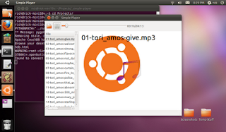
The app works by letting the user choose a directory. Simple Player then puts all the media into a list. The user can choose media to play from that list.

This tutorial uses Quickly, which is an easy and fun way to manage application creation, editing, packaging, and distribution using simple commands from the terminal. Don't worry if you are used to using an IDE for writing applications, Quickly is super easy to use.

Requirements
This tutorial is for Ubuntu Natty Narwhal (11.04). There are some key differences between 10.10 and 11.04 versions of Quickly and other tools that will make it hard to do the tutorial if you are not on Natty. So, probably best to make sure you are running 11.04.

You also need Quickly. To install Quickly:

$sudo apt-get install quickly python-quickly.widgets

This tutorial also uses a yet to be merged branch of Quickly Widgets. In a few weeks, you can just install quickly-widgets, but for now, you'll need to get the branch:

$bzr branch lp:~rick-rickspencer3/quidgets/natty-trunk

Note that these are alpha versions, so there may be bugs.

Caution About Copy and Pasting Code

In Python, white space is very significant, especially in terms of indentions. In HTML, white space is not. As a result, Blog postings frequently mangle Python code, no matter how carefully a blogger might format it. So while you're following along, be careful about copying and pasting out of here.

If you're going to copy and paste, you might want to use the code for the tutorial project in launchpad, from this:
Link to Code File in the Launchpad Project

You can also look at the tutorial in text format this:
Link to this tutorial in text for in Launchpad

Creating the Application
You get started by creating a Quickly project using the ubuntu-application template. Run this command in the terminal:
$quickly create ubuntu-application simple-player

This will create and run your application for you.
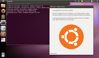
Notice that the application knows it is called Simple Player, and the menus and everything work.

To edit and run the application, you need to use the terminal from within the simple-player directory that was created. So, change into that directory for running commands:

$cd simple-player

Edit the User Interface
We'll start by the User Interface with the Glade UI editor. We'll be adding a lot of things to the UI from code, so we can't build it all in Glade. But we can do some key things. We can:
  • Layout the HPaned that separates the list from the media playing area
  • Set up the toolbar
Get Started
To run Glade with a Quickly project, you have to use this command from within your project's directory:
$quickly design

If you just try to run Glade directly, it won't work with your project.
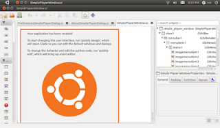
Now that Glade is open, we'll start out by deleting some of the stuff that Quickly put in there automatically. Delete items by selecting them and hitting the delete key. So, delete:
  • label1
  • image1
  • label2
This will leave you with a nice blank slate for your app:
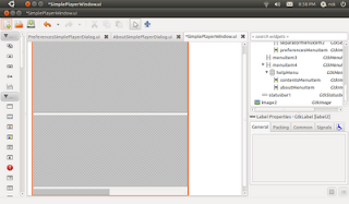
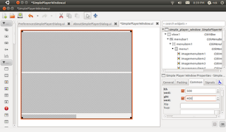
Now, we want to make sure the window doesn't open too small when the app runs. Scroll to the top of the TreeView in the upper right of Glade, and select simple_player_window. Then in the editor below, click the common tab, and set the Width Request and Height Request.
There's also a small bug in the quickly-application template, but it's easy to fix. Select statusbar1, then on the packing tab, set "Pack type" to "End".

Save your changes or they won't show up when you try running the app! Then see how your changes worked by using the command:
$quickly run

A nice blank window, ready for us to party on!
Adding in Your Widgets
The main part of the user interface is going to have an area that divides between the list of media and the media when it is playing. There is widget for that called HPaned (Horizontal Paned). Find HPaned on the toolbox on the left, and click on it to active paint mode. Then click into the second open space in the main part of the window. This will put the HPaned in the window for you.
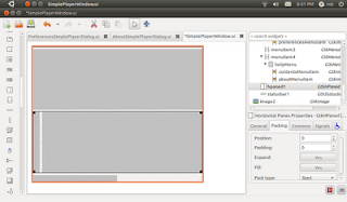
Make sure the HPaned starts out with an appropriate division of space. Do this by going to the General tab, and setting an appropriate number of pixels in Position property.
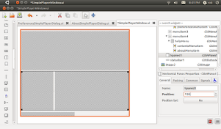
The user should be able to scroll through the list, so click on ScrolledWindow in the toolbar, and then click in the left hand part of the HPaned to place it in there.

Now add a toolbar. Find the toolbar icon in the toolbox, click on it and click in the top space open space. This will cause that space to collapse, because the toolbar is empty by default.
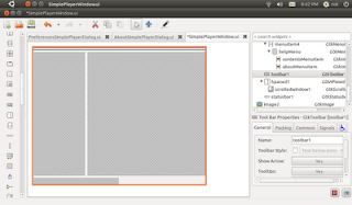
To add the open button click the edit button (looks like pencil) in Glade's toolbar. This will bring up the toolbar editing dialog. Switch to the Hierarchy tab, and click "Add". This will add a default toolbar button.

To turn this default button into an open button, first, rename the button to openbutton (this will make it easier to refer to in code). Then under Edit Image set Stock Id to "Open". That's all you need to do to make an open button in Glade.
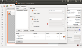
Due to a bug in the current version of Glade, you might need to rename your tool bar button again. When you close the editor, look in the treeview. If the button is still called "toolbutton1", then select it, and use the general tab to change the Name property to "openbutton". Then save again.

Now if you use $quickly run again, you'll see that your toolbar button is there.

Coding the Media List
Making the Open Button Work
The open button will have an important job. It will respond to a click from the user, offer a directory chooser, and then build a list of media in that directory. So, it's time write some code.

You can use:
$quickly edit &

This will open your code Gedit, the default text and code editor for Ubuntu.

Switch to the file called "simple-player". This is the file for your main window, and the file that gets run when users run your app from Ubuntu.
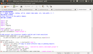
First let's make sure that the open button is hooked up to the code. Create a function to handle the signal that looks like this (and don't forget about proper space indenting in Python!):

def openbutton_clicked_event(self, widget, data=None):
print "OPEN"


Put this function under "finish_initializing", but above "on_preferences_changed". Save the code, run the app, and when you click the button, you should see "OPEN" printed out to the terminal.

How did this work? Your Quickly project used the auto-signals feature to connect the button to the event. To use auto-sginals, simple follow this pattern when you create a signal handlder:

def widgetname_eventname_event(self, widget, data=None):

Sometimes a signal handler will require a different signature, but (self, widget, data=None) is the most common.

Getting the Directory from the User
We'll use a convenience function built into Quickly Widgets to get the directory info from the user. First, go to the import section of the simple-player file, and around line 11 add an import statement:


from quickly import prompts

Then add to your openbutton_clicked_event function the code to prompt the user so it looks like this:

def openbutton_clicked_event(self, widget, data=None):
#let the user choose a path with the directory chooser
response, path = prompts.choose_directory()

#make certain the user said ok before working
if response == gtk.RESPONSE_OK:
#iterate through root directory
for root, dirs, files in os.walk(path):
#iterate through each file
for f in files:
#make a full path to the file
print os.path.join(root,f)
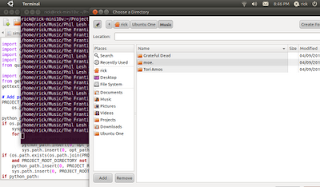
Now when you run the app you can select a directory, and it will print a full path to each file encountered. Nice start, but what the function needs to do is build a list of files that are media files and display those to the user.

Defining Media Files
This app will use a simple system of looking at file extensions to determine if files are media files. Start by specifying what file types are supporting. Add this in finish_initializing to create 2 lists of supported media:

self.supported_video_formats = [".ogv",".avi"]
self.supported_audio_formats = [".ogg",".mp3"]

GStreamer supports a lot of media types so ,of course, you can add more supported types, but this is fine to start with.

Now change the openbutton handler to only look for these file types:

def openbutton_clicked_event(self, widget, data=None):
#let the user choose a path with the directory chooser
response, path = prompts.choose_directory()

#make certain the user said ok before working
if response == gtk.RESPONSE_OK:
#make one list of support formats
formats = self.supported_video_formats + self.supported_audio_formats
#iterate through root directory
for root, dirs, files in os.walk(path):
#iterate through each file
for f in files:
#check if the file is a supported formats
for format in formats:
if f.lower().endswith(format):
#make a full path to the file
print os.path.join(root,f)

This will now only print out files of supported formats.

Build a List of Media Files
Simple Player will create a list of dictionaries. Each dictionary will have all the information that is needed to display and play the file. Simple Player will need to know the File name to display to the user, a URI to the file so that the file can be played, and the type of media. So, we'll create a list and add a dictionary to each support type to it.

def openbutton_clicked_event(self, widget, data=None):
#let the user choose a path with the directory chooser
response, path = prompts.choose_directory()

#make certain the user said ok before working
if response == gtk.RESPONSE_OK:
#make one list of support formats
formats = self.supported_video_formats + self.supported_audio_formats

#make a list of the supported media files
media_files = []
#iterate through root directory
for root, dirs, files in os.walk(path):
#iterate through each file
for f in files:
#check if the file is a supported formats
for format in formats:
if f.lower().endswith(format):
#create a URI in a format gstreamer likes
file_uri = "file://" + os.path.join(root,f)

#add a dictionary to the list of media files
media_files.append({"File":f,"uri":file_uri, "format":format})
print media_files

Display the List to the User
A DictionaryGrid is the easiest way to display the files, and to allow the user to click on them. So import DicationaryGrid at line 12, like this:

from quickly.widgets.dictionary_grid import DictionaryGrid
Starting in Natty, every window has a ui collection. You can use it to access all of the widgets that you have defined in Glade by their names. So, creating the list of media files, you can remove any old grids in the scrolled window like this:

for c in self.ui.scrolledwindow1.get_children():
self.ui.scrolledwindow1.remove(c)
Then create a new DictionaryGrid. We only want one column, to the view the files, so we'll set up the grid like this:

#create the grid with list of dictionaries
#only show the File column
media_grid = DictionaryGrid(media_files, keys=["File"])

#show the grid, and add it to the scrolled window
media_grid.show()
self.ui.scrolledwindow1.add(media_grid)

So now the whole function looks like this:

def openbutton_clicked_event(self, widget, data=None):
#let the user choose a path with the directory chooser
response, path = prompts.choose_directory()

#make certain the user said ok before working
if response == gtk.RESPONSE_OK:
#make one list of support formats
formats = self.supported_video_formats + self.supported_audio_formats

#make a list of the supported media files
media_files = []
#iterate through root directory
for root, dirs, files in os.walk(path):
#iterate through each file
for f in files:
#check if the file is a supported formats
for format in formats:
if f.lower().endswith(format):
#create a URI in a format gstreamer likes
file_uri = "file://" + os.path.join(root,f)

#add a dictionary to the list of media files
media_files.append({"File":f,"uri":file_uri, "format":format})

#remove any children in scrolled window
for c in self.ui.scrolledwindow1.get_children():
self.ui.scrolledwindow1.remove(c)

#create the grid with list of dictionaries
#only show the File column
media_grid = DictionaryGrid(media_files, keys=["File"])

#show the grid, and add it to the scrolled window
media_grid.show()
self.ui.scrolledwindow1.add(media_grid)

Now the list is displayed when the user picks the directory.

Playing the Media
Adding the MediaPlayer
So now that we have the list of media for the users to interact with, we will use MediaPlayerBox to actually play the media. MediaPlayerBox is not yet integrated into Glade, so we'll have to write code to add it in. As usually, start with an import:

from quickly.widgets.media_player_box import MediaPlayerBox

Then, we'll create and show a MediaPlayerBox in the finish_initializing function. By default, a MediaPlayerBox does not show it's own controls, so pass in True to set the "controls_visible" property to True. You can also do things like this:


player.controls_visible = False
player.controls_visible = True

to control the visibility of the controls.

Since we'll be accessing it a lot, we'll create as a member variable in the SimplePlayerWindow class. Then to put it in the right hand part of the HPaned, we use the add2 function (add1() would put it in the left hand part).

self.player = MediaPlayerBox(True)
self.player.show()
self.ui.hpaned1.add2(self.player)


Connecting to the DictionaryGrid Signals
Now we need to connect the dictionary_grid's "selection_changed" event, and play the selected media. So back in the openbutton_clicked_event function, after creating the grid, we can connect to this signal. We'll play a file when selection changes, so we'll connect to a play_file function (which we haven't created yet). This goes at the end of the function:

#hook up to the selection_changed event
media_grid.connect("selection_changed", self.play_file)
Now create that play_file function, it should look like this:

def play_file(self, widget, selected_rows, data=None):
print selected_rows[-1]["uri"]

Notice that the signature for the function is a little different than normal. When the DictionaryGrid fires this signal, it also passes the dictionaries for each row that is now selected. This greatly simplifies things, as typcially you just want to work with the data in the selected rows. If you need to know more about the DictionaryGrid, it passes itself in as the "widget" argument, so you can just work with that.

All the function does now is get the last item in the list of selected rows (in Python, you can use -1 as an index to get the last item in a list. Then it prints the URI for that row that we stored in the dictionary back in openbutton_clicked_event.
Setting the URI and calling play()
Now that we have the URI to play, it's a simple matter to play it. We simply set the uri property of our MediaPlayerBox, and then tell it to stop playing any file it may be playing, and then to play the selected file:

def play_file(self, widget, selected_rows, data=None):
self.player.stop()
self.player.uri = selected_rows[-1]["uri"]
self.player.play()

Now users can click on Videos and movies, and they will play. Since we decided to show the MediaPlayerBox's controls when we created it, we don't need to do any work to enable pausing or stopping. However, if you were creating your own controls, you could use player.pause() and player.stop() to use those functions.


Connecting to the "end-of-file" Signal
When a media files ends, users will expect the next file played automatically. It's easy to find out when a media file ends using the MediaPlayerBox's "end-of-file" signal. Back in finish_initializing, after creating the MediaPlayerBox, connect to that signal:

self.player.connect("end-of-file",self.play_next_file)

Changing the Selection of the DictionaryGrid
Create the play_next_file function in order to respond when a file is done playing:

def play_next_file(self, widget, file_uri):
print file_uri

The file_uri argument is the URI for the file that just finished, so that's not much use in this case. There is no particularly easy way to select the next row in a DictionaryGrid. But every widget in Quickly Widgets is a subclass of another PyGtk class. Therefore, you always have access to full power of PyGtk. A DictionaryGrid is a TreeView, so you can write code to select the next item in a TreeView:

def play_next_file(self, widget, file_uri):
#get a reference to the current grid
grid = self.ui.scrolledwindow1.get_children()[0]

#get a gtk selection object from that grid
selection = grid.get_selection()

#get the selected row, and just return if none are selected
model, rows = selection.get_selected_rows()
if len(rows) == 0:
return

#calculate the next row to be selected by finding
#the last selected row in the list of selected rows
#and incrementing by 1
next_to_select = rows[-1][0] + 1

#if this is not the last row in the last
#unselect all rows, select the next row, and call the
#play_file handle, passing in the now selected row
if next_to_select < len(grid.rows):
selection.unselect_all()
selection.select_path(next_to_select)
self.play_file(self,grid.selected_rows)

Making an Audio File Screen
Notice that when playing a song instead of a video, the media player is blank, or a black box, depending on whether a video has been player before.
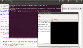
It would be nicer to show the user some kind of visualization when a song is playing. The easiest thing to do would be to create a gtk.Image object, and swap it when for the MediaPlayerBox when an audio file is playing. However, there are more powerful tools at our disposal that we can use to create a bit richer of a user experience.

This section will use a GooCanvas to show you how to compose images and text together. A GooCanvas is a very flexible surface on which you can compose and animate all kinds of 2D experiences for users. This tutorial will just scratch the surface, by combining 2 images and some text together. We'll show the Ubuntu logo image that is already built into your project, but a musical note on top of that for some style, and then put the current song playing as some text.

Create a Goo Canvas
Naturally, you need to import the goocanvas module:

import goocanvas

Then, in the finish_initializing function, create and show a goocanvas.Canvas:

self.goocanvas = goocanvas.Canvas()
self.goocanvas.show()

The goocanvas will only be added to the window when there is an audio playing file, so don't pack it into the window yet. But let's an image to the goocanvas so we can make sure that we have the system working.

Add Pictures to the GooCanvas
Add an image to the goocanvas by creating a goocanvas.Image object. First, we'll need to create a gtk.Pixbuf object. You can think of a gtk.Pixbuf as an image stored in memory, but it has a lot of functions to make them easier to work with than just having raw image data. We want to use the file called "background.png". In a quickly project, media files like images and sounds should always go into the data/media directory so that when users install your programs, the files will go to the correct place. There is a helper function called get_media_file built inot quickly projects to get a URI for any media file in the media directory. You should always use this function to get a path to media files, as this function will work even when your program is installed and the files are put into different places on the user's computer. get_media_file returns a URI, but a pixbuf expects a normal path. It's easy to fix this stripping out the beginning of the URI. Since it was created for you, can could also change the way get_media_player works, or create a new function, but this works too:

logo_file = helpers.get_media_file("background.png")
logo_file = logo_file.replace("file:///","")
logo_pb = gtk.gdk.pixbuf_new_from_file(logo_file)


You don't actually pass the goocanvas.Image into the goocanvas.Canvas, rather you tell the goocanvas.Image that it's parent is the rootA_items of the goocanvas. You can also set other properties when you create it, such as the x and y coordinates, and of course the pixbuf to use:

root_item=self.goocanvas.get_root_item()
goocanvas.Image(parent=root_item, pixbuf=logo_pb,x=20,y=20)


Show the GooCanvas When a Song is Playing
So now we want to take the MediaPlayerBox out of the HPaned when a song is playing and show the goocanvas, and also visa versa. We can easily extract the format of the file because we included it in the dictionary for the row when we created the DictionaryGrid in the openbutton_clicked_event function:

format = selected_rows[0]["format"]

We can also get a reference to the visual that is currently in use:

current_visual = self.ui.hpaned1.get_child2()

Knowing those two things, we can then figure out whether to put in the goocanvas.Canvas or the MediaPlayerBox. So the whole function will look like this:

def play_file(self, widget, selected_rows, data=None):
self.player.stop()
format = selected_rows[0]["format"]
current_visual = self.ui.hpaned1.get_child2()

#check if the format of the current file is audio
if format in self.supported_audio_formats:
#if it is audio, see if the current visual is
#the goocanvas, if it's not, do a swapperoo
if current_visual is not self.goocanvas:
self.ui.hpaned1.remove(current_visual)
self.ui.hpaned1.add2(self.goocanvas)
else:
#do the same thing for the player
if current_visual is not self.player:
self.ui.hpaned1.remove(current_visual)
self.ui.hpaned1.add2(self.player)

#go ahead and play the file
self.player.uri = selected_rows[-1]["uri"]
self.player.play()


Add another Image to Canvas
We can add the note image to the goocanvas.Canvas in the same way we added the background image. However, this time we'll play with the scale a bit:


note_file = helpers.get_media_file("note.png")
note_file = note_file.replace("file:///","")
note_pb = gtk.gdk.pixbuf_new_from_file(note_file)
note = goocanvas.Image(parent=root_item, pixbuf=note_pb,x=175,y=255)
note.scale(.75,.6)

Remember for this to work, you have to put a note.png file in the data/media directory for your project. If your image is a different size, you'll need to tweak the x, y, and scale as well.

(BTW, thanks to Daniel Fore for making the artwork used here. If you haven't had the pleasure of working Dan, he is a really great guy, as well as a talented artist and designer. He's also the leader of the #elementary project.)

A goocanvas.Image is a goocanvas.Item. There are different kinds of Items and many of interesting visual things you can do with them. There are items like shapes and paths. You can change things like their scale, rotation, and opacity. You can even animate them!
Add Text to the goocanvas.Canvas
One kind of goocanvas.Item is goocanvas.Text. You create it like a goocanvas.Image. We won't use any text when we create it, because that will be set later when we are playing a song. Since the goocanvas.Text will be accessed from the play_file function, it should be a member variable for the window. So after adding the note image in the finish_initializing function, you can go ahead and add the text.

self.song_text = goocanvas.Text(parent=root_item,text="", x=5, y=5)
self.song_text.set_property("font","Ubuntu")
self.song_text.scale(2,2)

Update the Text
The text property of the goocanvas.Text object should then be set when an audio file is played. Add a line of code to do this in the play_file function, after you've determined the file is an audio file:

self.song_text.set_property("text",selected_rows[0]["File"])

Now when an audio file is playing the title shows.

Moving the Media Player Controls
You've probably noticed a pretty bad bug, when an audio file is playing the user can't access the controls for the media player. Even if that were not the case, are 2 toolbars, one for the controls, and one that only has the openbutton. Also, the controls are shifted over because of the DictionaryGrid, so the time labels are not visible by default.

Fortunately, PyGtk let's you move widgets around really easily. So, it's possible to write a little code that:
  1. Creates the openbutton in code instead of glade
  2. Takes the toolbar for the MediaPlayer controls out of the MediaPlayer
  3. Inserts the openbutton into the controls exactly where we want it
  4. Adds the controls back into the window
To start, go back to Glade, and delete the toolbar you added before. Replace it with an HBox. When prompted, set Number of Items to 1. It should be named hbox1 by default. After adding the HBox choose the packing tab, and set Expand to "No". Otherwise, the HBox will take up all the room it can, making the toolbar huge when you add it back in.
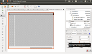
Then, back in finish_initializing, after creating the MediaPlayerBox, remove the controls:

self.player = MediaPlayerBox(True)
self.player.remove(self.player.controls)

Then, create a new openbutton:

open_button = gtk.ToolButton()

We still want the open button to be a stock button. For gtk.ToolButtons, use the set_stock_id function to set the right stock item.

open_button.set_stock_id(gtk.STOCK_OPEN)

Then show the button, and connect it to the existing signal handler.

open_button.show()
open_button.connect("clicked",self.openbutton_clicked_event)

The MediaPlayerBox's controls are a gtk.Toolbar object. So, insert the open_button into the controls using the gtk.Toobar classes insert command. Pass in a zero to tell the gtk.Toolbar to put open_button first. Then you can show the controls, and pack them into the window:

self.player.controls.insert(open_button, 0)
self.ui.hbox1.pack_start(self.player.controls, True)

Now users can use the controls even when audio is playing!
Conclusion
This tutorial demonstrated how to use Quickly, Quickly Widgets, and PyGtk to build a functional and dynamic media player UI, and how to use a goocanvas.Canvas to add interesting visual effects to your program.

The next tutorial will show 2 different ways of implementing play lists, using text files, using pickling, or using desktopcouch for storing files.

API Reference
PyGtk
Quickly Widgets
Reference documentation for Quickly Widgets isn't currently hosted anywhere. However, the code is thoroughly documented, so until the docs are hosted, you can use pydocs to view them locally. To do this, first start pydocs on a local port, such as:
$pydocs -p 1234

Then you can browse the pydocs by opening your web browser and going to http:localhost:1234. Search for quickly, then browse the widgets and prompts libraries.

Since MediaPlayerBox is not installed yet, you can look at the doc comments in the code for the modules in natty-branch/quickly/widgets/media_player_box.py.
GooCanvas
GStreamer
MediaPlayerBox uses a GStreamer playbin to deliver media playing functionality. GStreamer si super powerful, so if you want to do more with it, you can read the docs.